Case study
Carbon DeFi
On-chain platform for advanced trading strategies, serving professional traders.
View live product (opens in a new tab)- ~28%less friction in complex trading flows
- ~12%improved long-term engagement
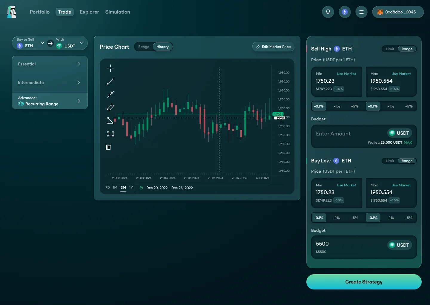
The problem
Patent-level complexity made the product feel expert-only
Carbon’s trading engine was defined by a roughly 150-page mathematical patent. There was no reference product and no familiar UX pattern to reuse.
The existing design was cold and aimed only at very professional traders. As a result, fewer users explored strategies, sessions were shorter, and fewer users completed and executed strategies.
The job: turn patented financial mechanics into flows traders could understand, without hiding price ranges, asset exposure or execution constraints.
Research & insights
Two interviews changed the design
Every week I interviewed two groups: long-time users who knew earlier versions of the product, and newer users. Two insights changed the design.
- Insight 01
A trader described the value he got from the simulator.
What changedAn “execute strategy” button inside the simulator.
- Insight 02
Another trader talked about the charts and information next to the strategy form.
What changedChanges to the information hierarchy around the form.
Key decisions
Complex only behind the scenes
Users should feel smart and confident, with no question marks. If there are too many question marks, we did something wrong.
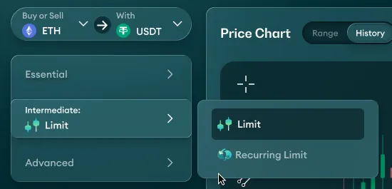
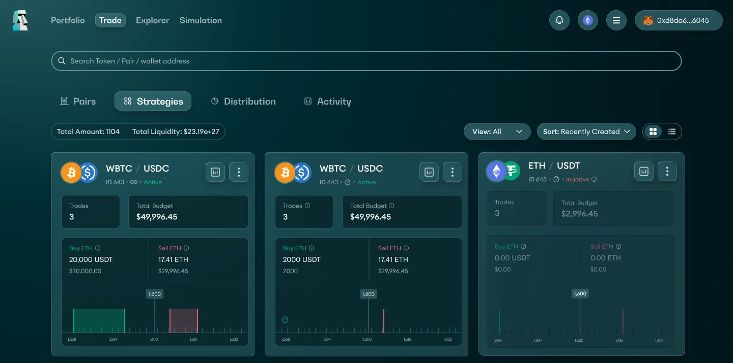
Organize by user intent, not by feature catalog
- Trade-off
- Powerful tools moved one level deeper.
- Why I chose it
- Users could mistake Carbon for a basic swap interface, or miss which strategy fit their goal. Grouping strategy types into three levels, Essential, Intermediate and Advanced, gives every trader a clear way in, from a simple limit order to recurring strategies.
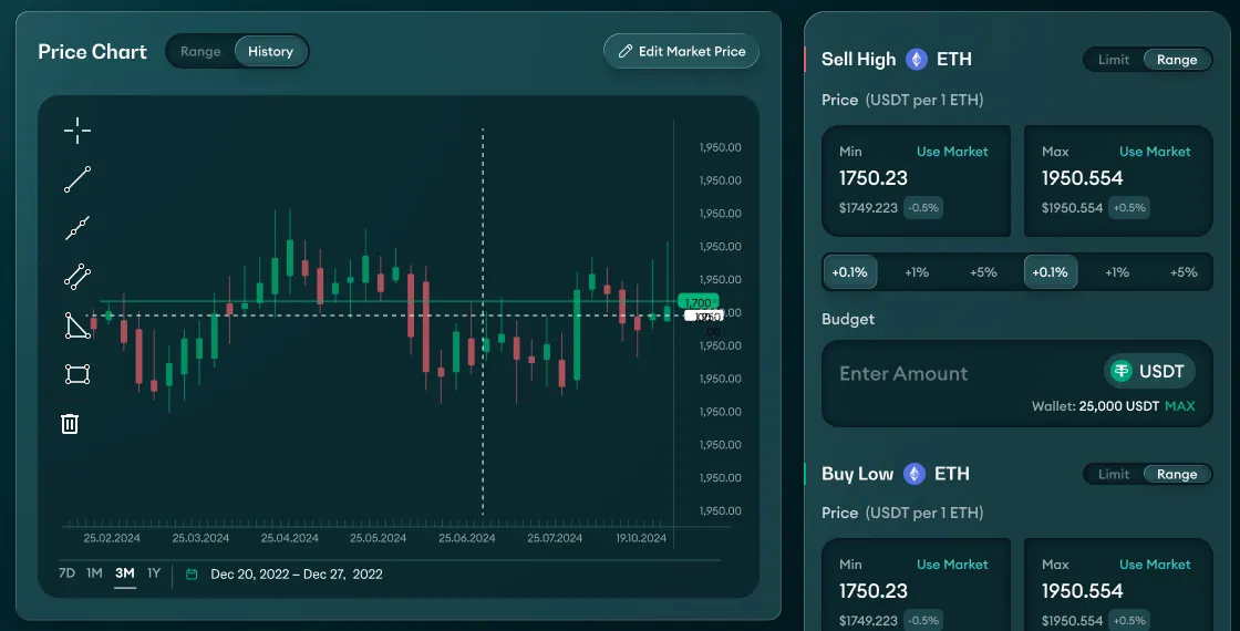
Show consequences next to the controls
- Trade-off
- A denser screen.
- Why I chose it
- The challenge wasn't adding controls; it was helping traders understand what their settings would do. Linking the chart to the strategy form shows the result before anything goes on-chain.
From simulation straight to execution
- Trade-off
- Risk of blurring hypothetical and real results, so we kept them clearly separated.
- Why I chose it
- Traders weren't always sure how a strategy would behave as prices moved. Testing and then executing in one flow turns the simulator into decision support.
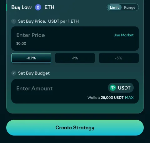
Public productAll screens are from the live, public product.
Explore the live platform(opens in a new tab)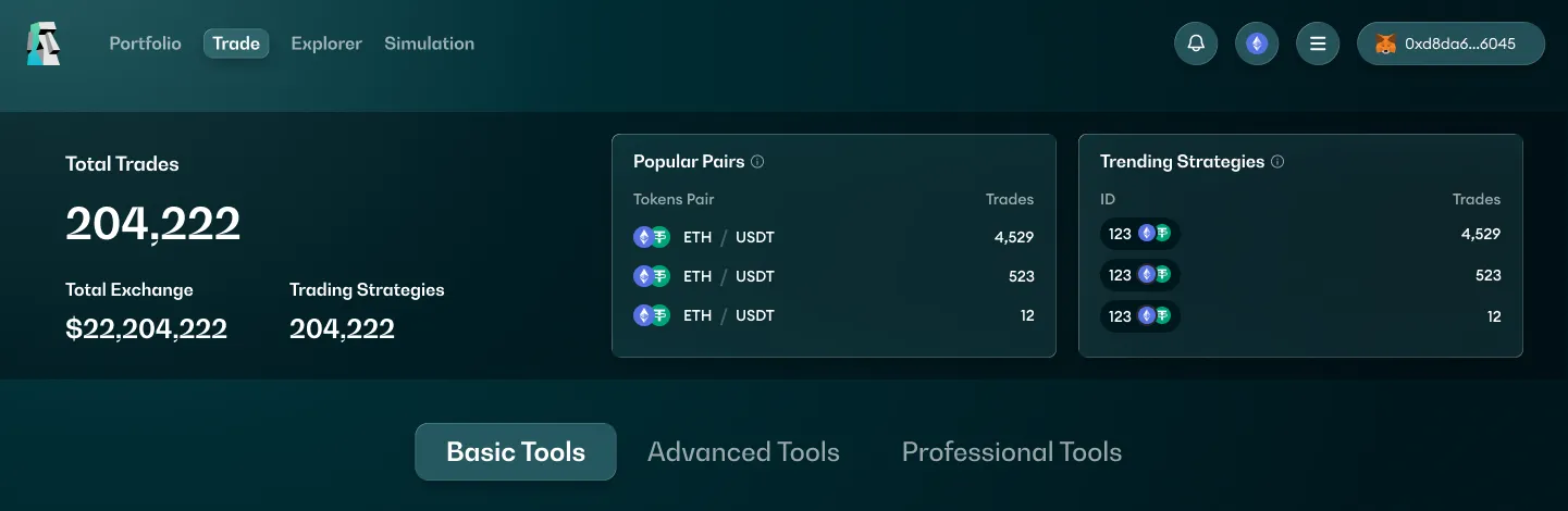
Design system & process
Designed from zero, validated in live prototypes
I was the only designer on Carbon. I designed it from zero: every screen, every dashboard and the design system. Alongside design, I ran the day-to-day work with development as a PM.
AI-native workflow. I worked with Claude Code, Figma Make and some Antigravity, and always delivered live prototypes. I structured the design system so it connects to Claude Code through MCP.
Typography
A characterful face for headlines, a clean one for the interface.
- Display · 48Lorem ipsum dolor
- Number · 361,234.56
- Heading · 18Lorem ipsum dolor sit amet
- Body · 14Lorem ipsum dolor sit amet, consectetur adipiscing elit, sed do eiusmod tempor.
- Label · 12Lorem ipsum
Colors
One bright action color, clear buy and sell signals, and a calm teal base.
- Buy#00E5AA → #00B063
- Sell#FF5C75 → #FF0064
- Warning#F67400
- Background#315D63 → #000406
- Inset#001518
- Surface#3E767D → #315D63
- Text secondary#F8FFFF · 60%
- Text#F8FFFF
Buttons
Rounded, glassy controls. Hover and click to try them.
Results
Less friction, longer engagement
~28% less friction in complex trading flows, measured by task completion and strategy execution.
~12% improved long-term engagement, driven by the advanced trading and simulation features.
Both were measured from the feature release to six months after.
More from Carbon
Making risk visible, without blocking experts
- UX spec
Errors users can actually fix
Generic swap errors didn’t show what users could fix and what the system couldn’t quote. I placed each error next to the input that caused it, separated user mistakes from route limits, and disabled the action while an error blocks it.
- Proposal
Overlap as a choice, not an error
When buy and sell ranges overlap, both can execute in the same price interval, and a generic warning interrupted traders who wanted exactly that. I reframed it as an advanced opt-in, “Enable Internal Arbitrage”, with the consequence spelled out and no promise of profit.
- Proposal
One anchor for two parallel ranges
Entering two related price ranges by hand was repetitive and easy to misalign. I made the sell range the anchor: traders enter one offset, and the buy range is calculated, read-only and stays parallel.
What I learned
Evidence is what brings everyone to agree
I learned to stand behind my decisions.
And that the way I present evidence, from research to live prototypes, is what brings everyone to agree.