Case study
BBS
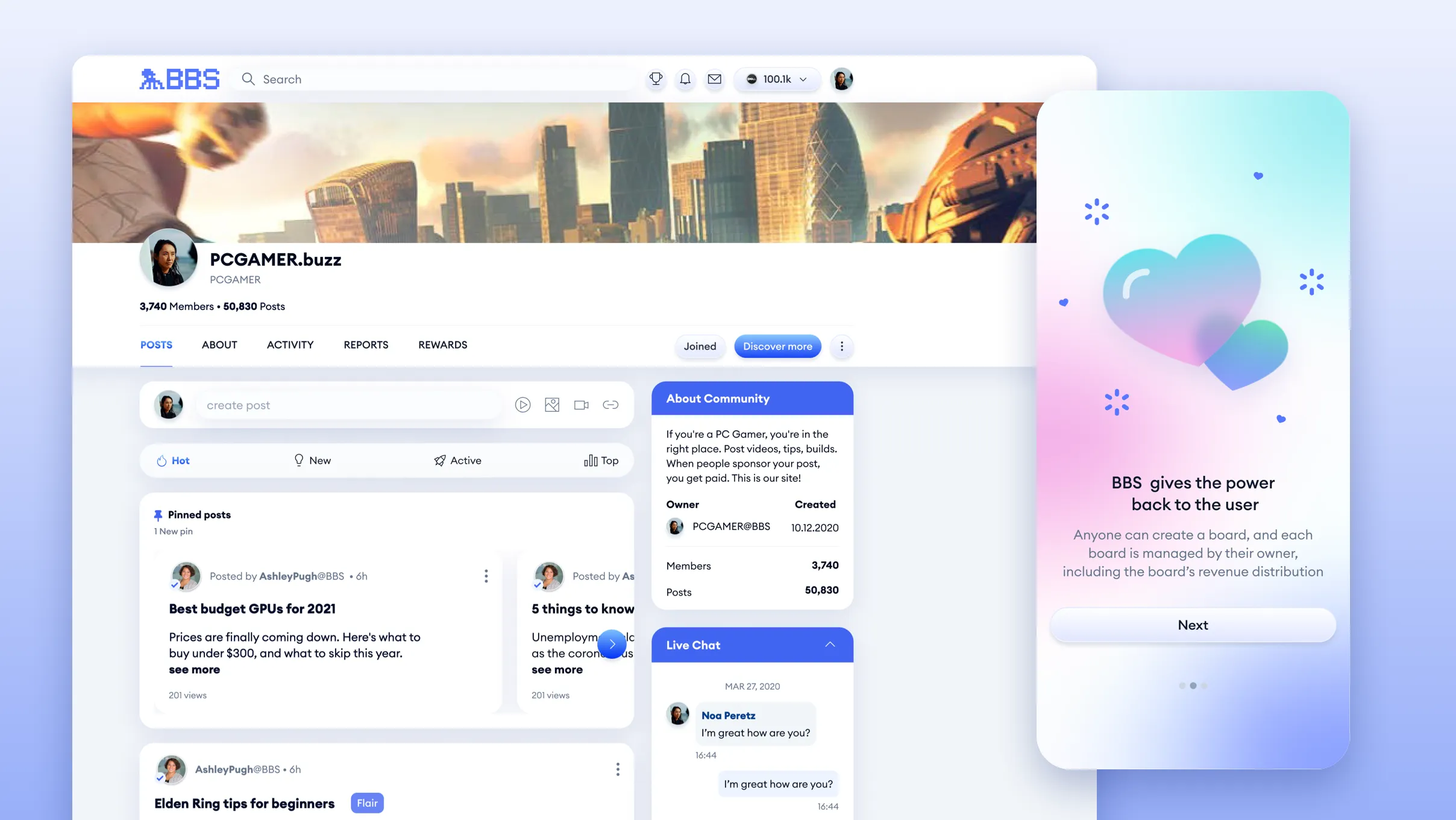
A Web3 social network where people own their identity and content, on web and mobile.
- ~10%increase in session time within three months of the mobile launch
- ~100Kdaily active users
The problem
Make the value obvious
A new Web3 social network had to give people a reason to join and stay.
Decentralized concepts were still unfamiliar, and wallet and on-chain steps added friction.
The job: show the value up front, from owning your content to building communities and earning from them, without hiding how it works.
Research & insights
Two insights shaped onboarding and video
I combined user interviews, analytics, session recordings and group conversations with users.
- Insight 01
New users didn’t immediately see what they gained by joining.
What changedOnboarding that explains the value up front, including how community owners and active members can earn.
- Insight 02
Video replies sparked deeper conversations than text.
What changedSwipe navigation through chains of reply videos, first on mobile, later brought to desktop.
Key decisions
Original by design, valuable by default
In 2020 we set out to be genuinely original in social media, and to make users see the value we brought, including the chance to earn, both as community owners and as active members.
Group-based content
- Trade-off
- Balancing easy discovery and posting with group context, permissions and structure.
- Why I chose it
- Communities give content context, and owners earn from the community they build. Owners manage their board, including its revenue distribution.
An ad server built around users' goals
- Trade-off
- Monetization versus user trust and the quality of the content experience.
- Why I chose it
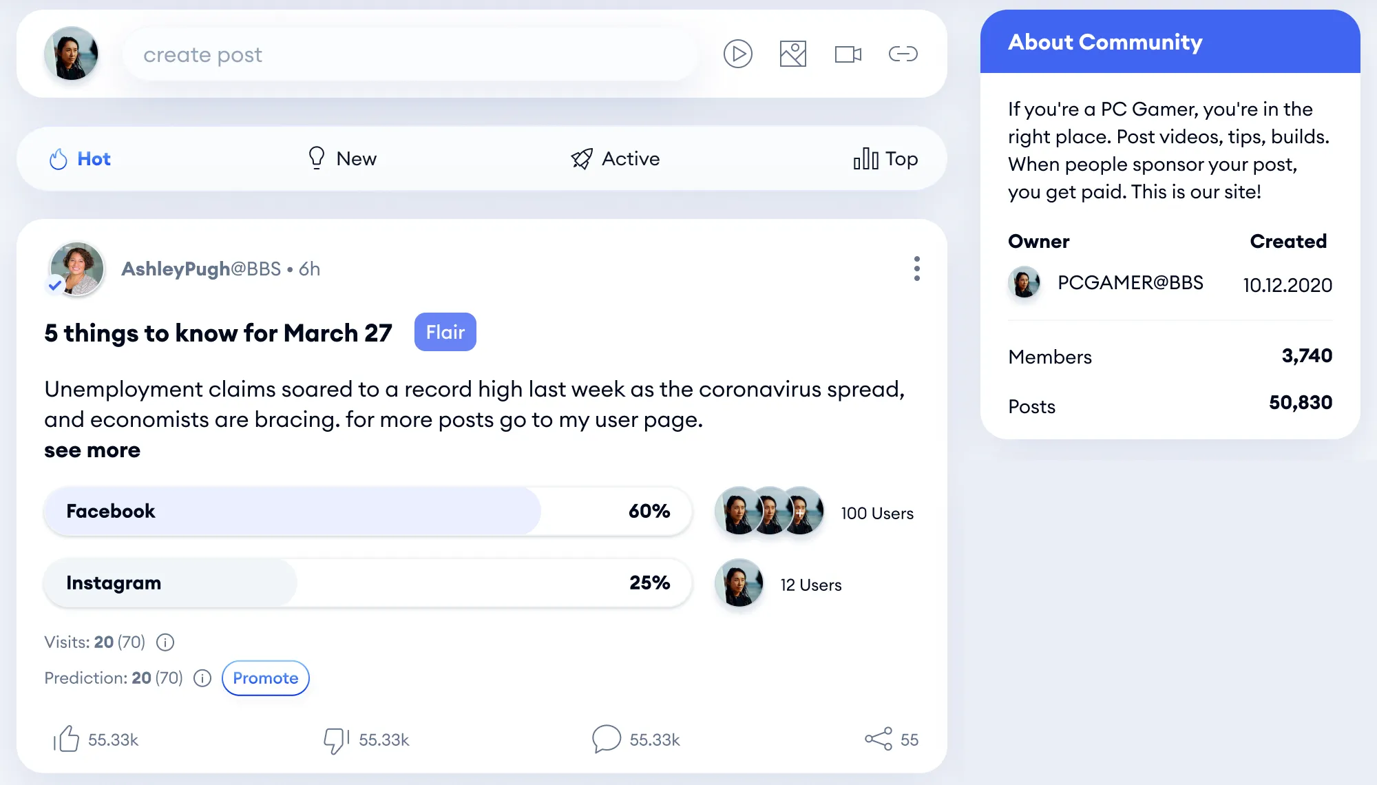
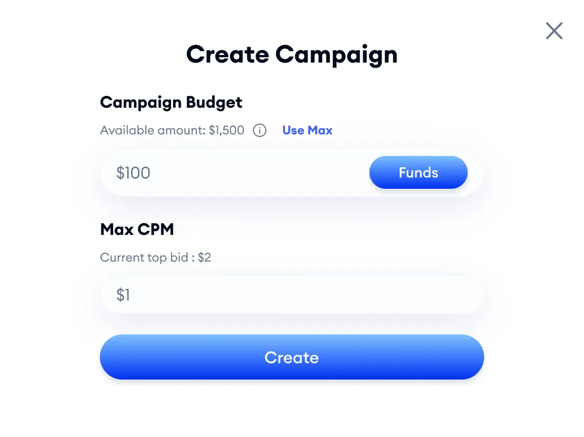
- I built an internal ad server where users could promote their own goals: their posts, the pages they created, and more. The whole system was designed around where and how users could earn from the platform: not only the company, and not only community owners, but regular users too.
Video debate threads
- Trade-off
- Richer expression versus more complex threads and discoverability.
- Why I chose it
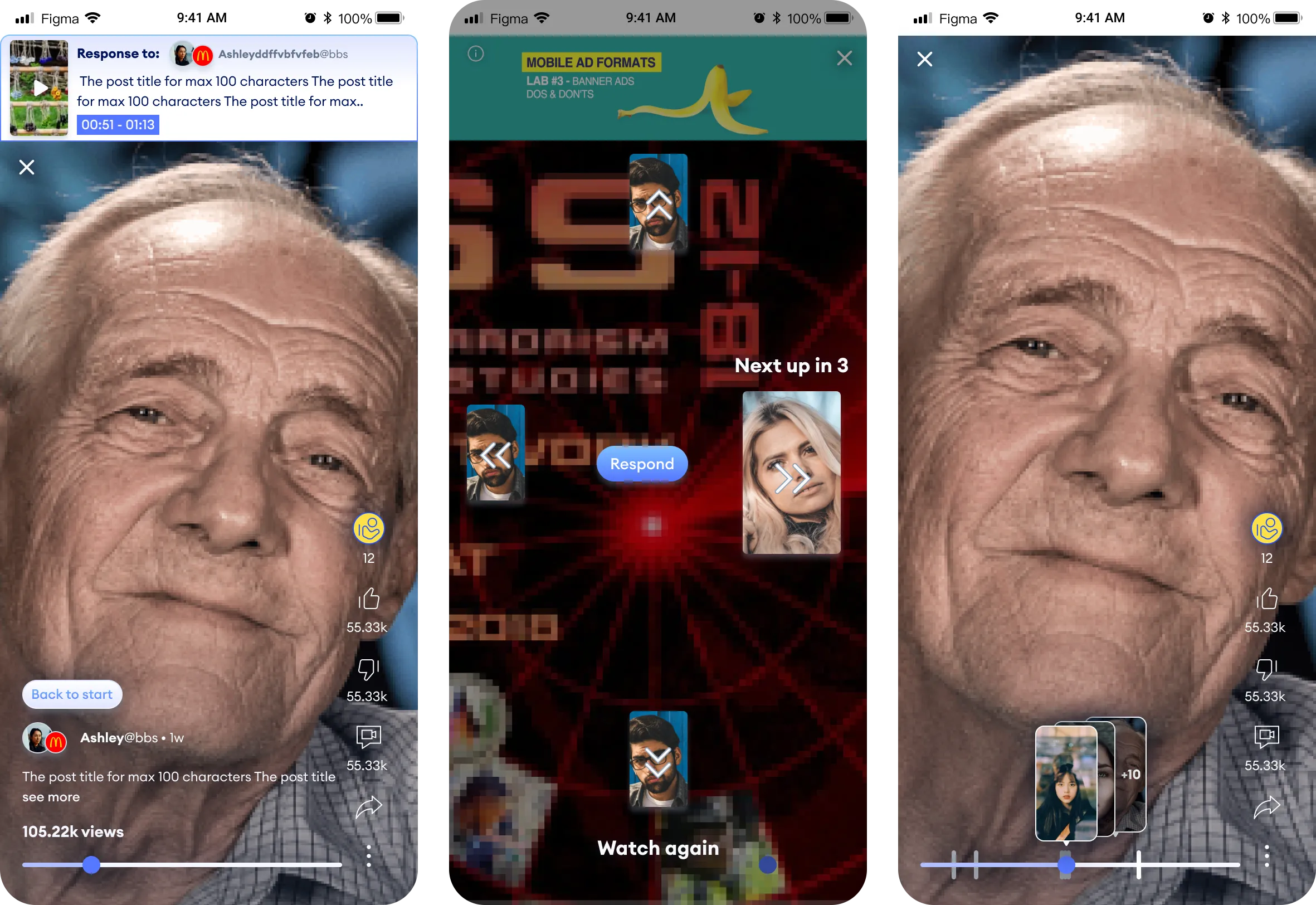
- Text threads flattened debates: tone and nuance got lost, and replies felt like comments rather than a conversation. Video replies let people answer a point face to face, and the recorder offered both video and voice, so joining a debate didn't require being on camera. To keep long debates easy to follow, I designed swipe navigation: left and right to move between replies, up and down to go deeper into a chain of replies. It was born on mobile, and its success brought it to desktop.
Solution · Web
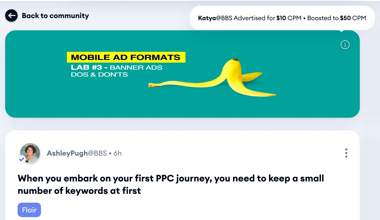
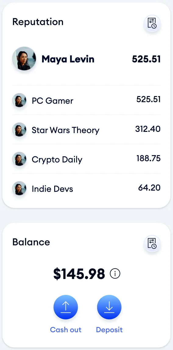
Web: earning, visible on every post and profile
The web platform came first. On a post, sponsored banners, tips and view predictions sit right next to the conversation. On a profile, members see their reputation in each community and their balance.
Shipped · no longer online
Solution · Mobile
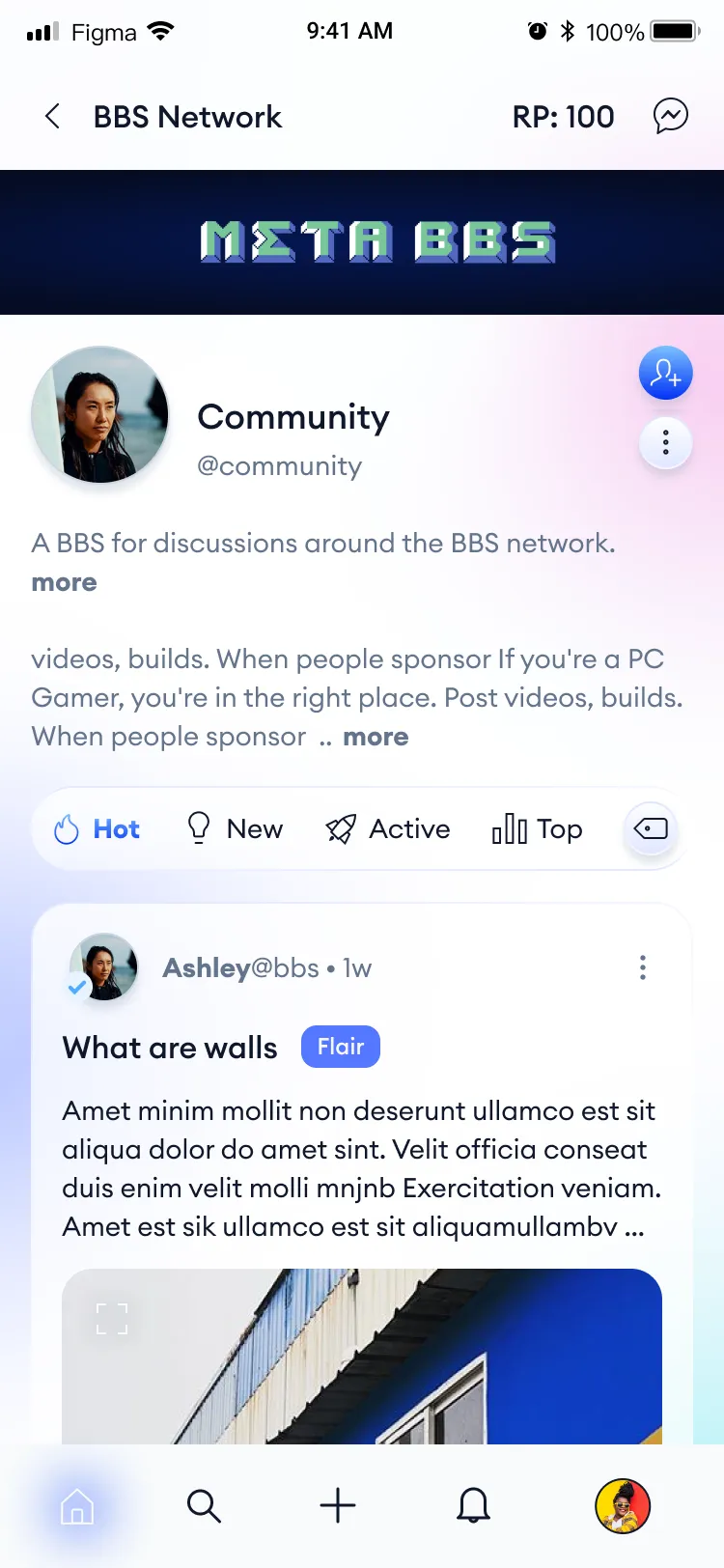
Mobile: built for the most frequent journeys, not shrunk from desktop
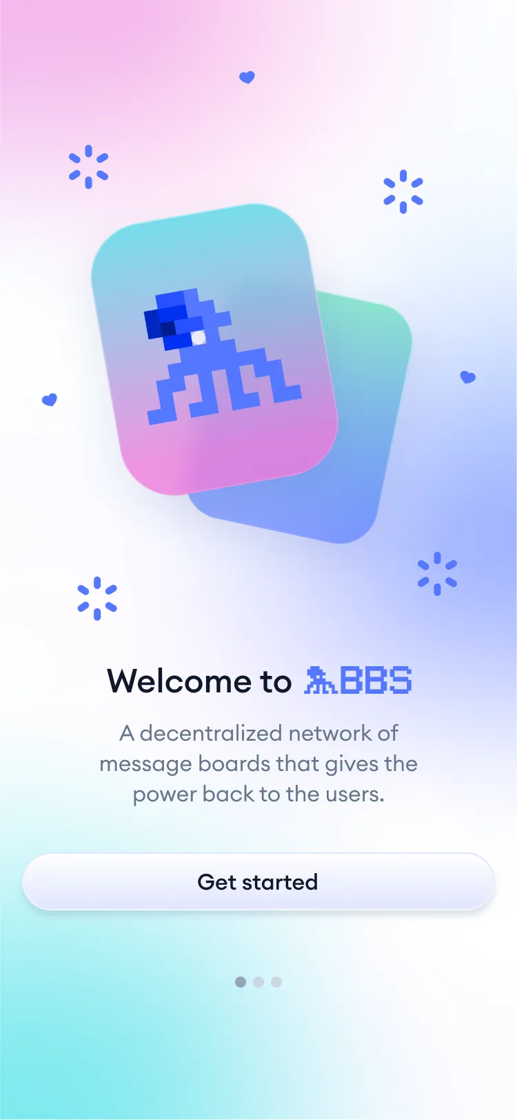
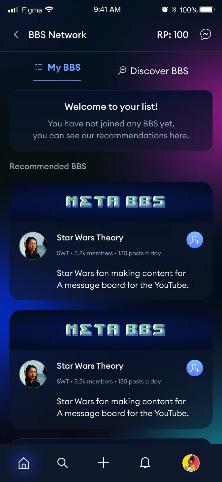
I led the translation of the web product to mobile. Within three months of the mobile launch, session time grew by ~10%.
Not every feature moved to mobile, and some went the other way. Swiping left, right, up and down through video replies to go deeper into a debate was born on mobile and later came to desktop.
On mobile we focused on the most frequent journeys and adjusted the hierarchy, rather than shrinking desktop screens.
Design system & process
Two platforms, two native systems
Web and mobile have separate design systems and very different visual designs. Mobile was designed for how people use their phones, not as a smaller desktop.
I directly managed 2 product designers, and later, as PM, also 2 front-end developers. I also contributed hands-on in Flutter on UI implementation, so design intent held up in production.
Web
Dense: 14px reading text, 32px buttons.
Typography · Euclid Circular A · Line height = size + 6
- Bold 24/30Lorem ipsum
- Bold 18/24Lorem ipsum dolor sit
- Regular 14/20Lorem ipsum dolor sit amet, consectetur adipiscing elit.
- Regular 12/18Lorem ipsum dolor
Colors
- Text#020A1D
- Blue#4164F2
- Flair#6783F5
- Earnings#078005
- Muted#64748B
- Page#F1F5F9
Mobile
Roomy: 16px reading text, full-width 44px buttons.
Typography · Euclid Circular A · Line height = size + 8
- Semibold 24/32Lorem ipsum
- Medium 18/26Lorem ipsum dolor sit
- Regular 16/24Lorem ipsum dolor sit amet, consectetur adipiscing elit.
- Regular 12/20Lorem ipsum dolor
Colors
- Primary Blue#2752FF
- Cobalt#5577FF
- Pink#EC79D9
- Turquoise#4BDFE8
- Light Green#6FE6BC
- Slate 900#0F172A
More from BBS
Earning, built into the product
An earning model for everyone
The whole system was designed around where and how users could earn: not only the company, and not only community owners, but regular users too.
Promoted posts
Members promote a post by predicting its views and staking reputation points on it. Promoters earn a reputation point for every view.
Super Comments
Paid comments, bought with tokens from the platform’s ecosystem, that appear at the top of the comment thread.
What I learned
Freedom to succeed
When I truly enjoy the work, ideas come everywhere, and that energy led to my promotion.
I also learned that with the right people around you, your success becomes theirs. That’s the manager I want to be: give people freedom, believe in them, and let the results speak.